Visual Identity Playbook

Developing a brand is more than just a creative exercise. It’s a discipline involving research, analysis, structured management, and implementation. But the work pays off; consistent and strategic branding sets you apart and builds strong brand equity. 

A brand is a system of verbal and visual frameworks and actions that create a memorable identity for your product or service. 

Within this framework, your visual identity is an ecosystem of visual elements and interactions that serve to amplify your brand message and create a unique and cohesive experience for the users, no matter where they communicate with your brand.
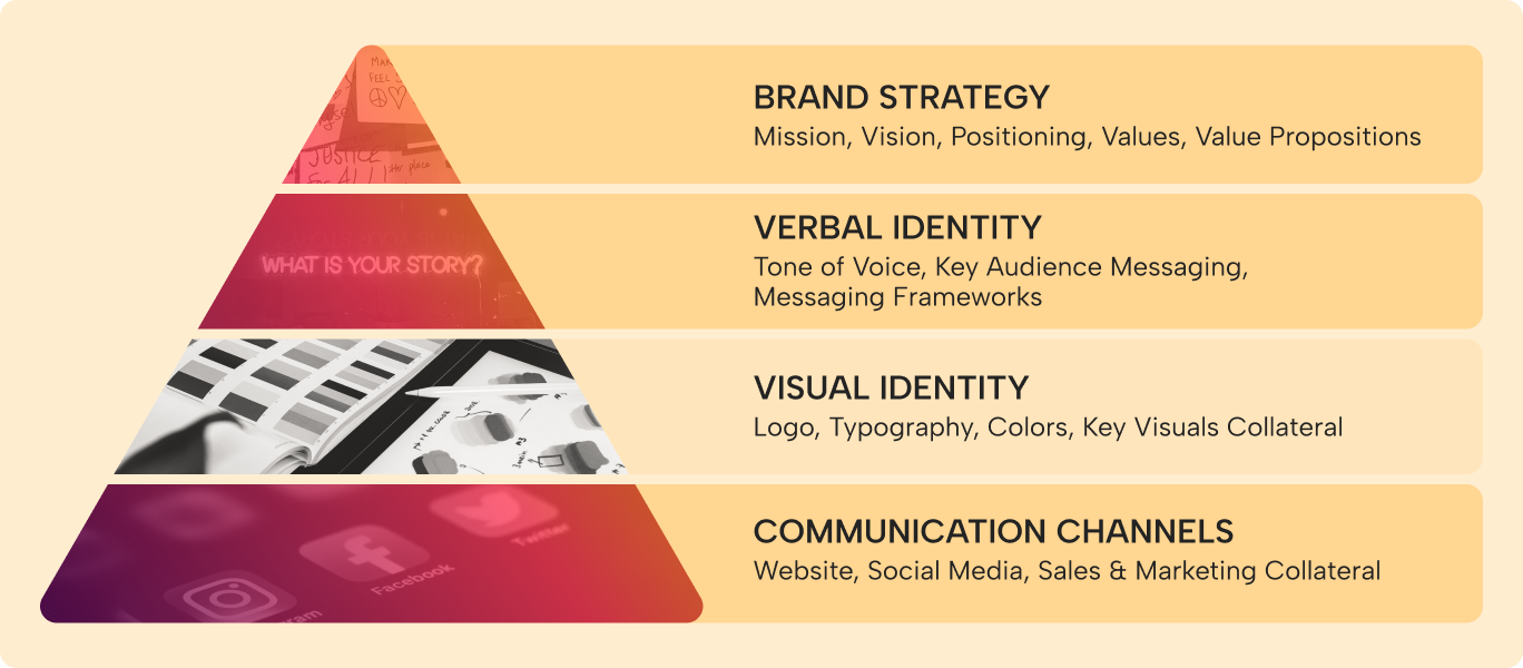
Visual Identity
Your visual identity is made up of several important components - learn about them below.

What is Visual Identity and Why Does it Matter?

While verbal identity helps create memorable messaging and communications, visual identity helps your brand achieve wide recognition by delivering visual consistency across all platforms. 

Visual Identity represents the brand's ability to connect with the audience through a culmination of color, type, graphics, and visual style that also guides all future content, relationships, and ultimately growth.

Defined visual systems give you control over the way others use your brand, and ensure that the execution is always of the highest quality, reflecting your brand as they are supposed to. 

Lack of visual consistency can lead to people not perceiving your company as a trustworthy, lasting partner to meet their needs.
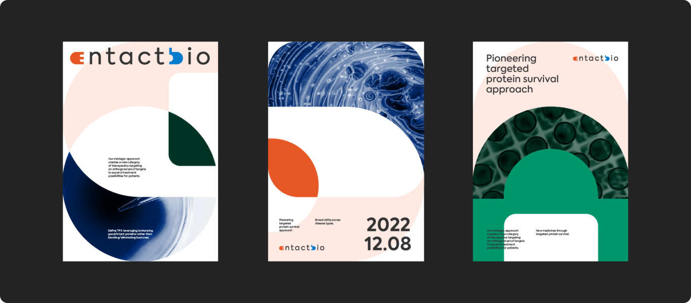
First example of Entact Bio's visual identity
Another example of Entact Bio's branding in use.
Example of how visual identity is helping create a memorable brand for Entact Bio.

What Should be Included in Visual Identity? 

Every visual identity is comprised of a set of foundational assets, which include:

  • Logotype and Logomark - a graphic mark used to represent your brand in the most succinct way possible. Can consist of Logotype only (wordmark) or Logotype and Logomark (wordmark with a symbol).

  • Primary and Secondary Color Palette - Main and complementary colors of your brand, usually between 3-7.

  • Fonts and Typography Pairings - Your main fonts for digital and physical spaces, as well as complementary fonts to create contrast in a balanced way.

  • Key Visuals (Supporting Icons, Photography, Infographics, 2D and 3D Assets and other) - Visual elements that tie the visual foundations together into a graphic theme that appears across all communication media of a brand.

An example of everything that should be included in a visual identity
An example of how visual identity can be used.
Take a look at how your visual identity can be translated to reality.

Competitive  Benchmarking

Visual identity should be inspired and underpinned by your brand strategy and conscious of market insights and competitor dynamics. It should be authentic to your brand and team and ownable within your category, helping you stand out and reflect your differentiation in your sector.

The competitive benchmarking of brands in your industry is an important starting point in visual identity development. Understanding visual trends in the industry and how often they fluctuate will provide important insight into building a visual identity that will feel like it belongs to your sector yet pushes it forward. 

Really assessing how the firm’s competitors are appearing within different channels helps understand the opportunities and gaps to leverage to build on the metrics you find most valuable to building your brand, metrics like brand awareness, sentiment, attributes, and associations.

Competitive benchmarking also allows you to assess what category codes help retain a connection to the company’s audience and those to avoid that make your brand seem like everyone else.

Visual Concepts

A brand concept is at the heart of every strong visual identity. It consists of a clever visual representation of core ideas behind a company's branding that brings together the underlying strategic direction with how you appear to the world. Visual concepts are built of unique insights or specific attributes or perspectives of the brand that can’t be copied or repeated by anyone else. 

For example, at the heart of the visual concept for NGP Capital brand lies an idea stemming from the firm’s overarching investment thesis, the convergence of the digital and physical. A simple but innately powerful and flexible use of a square to symbolize a pixel and the digital world, and a circle to symbolize Earth and our physical world.
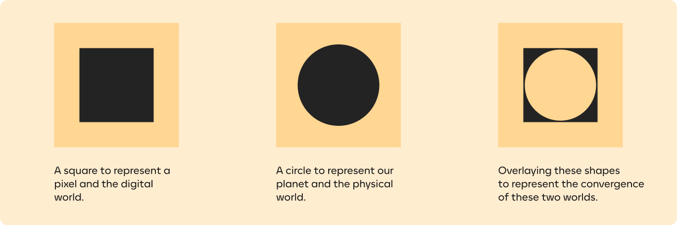
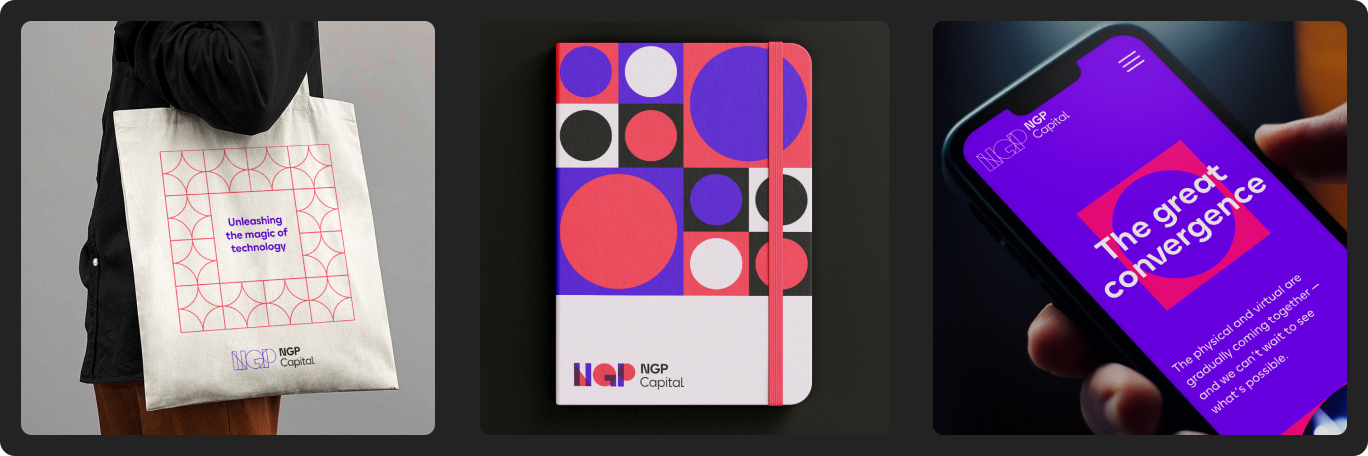
Visual components that were used to create NGP's brand.
How the NPG visual identity looks in use.
Here is an example of how a visual identity was translated for NGP Capital.


Visual identities with a strong concept at their core create a lasting impression and are easier to expand on because they already contain a strong visual logic and direction no matter what the ultimate application may be.

Brand Guidelines

Once the visual concept has been chosen and developed, brand guidelines exist to translate the rules of your brand to internal design and communications stakeholders so that they can consistently convey the brand to external audiences across all platforms. 

Comprehensive brand guidelines define everything from your brand strategy and messaging to logo usage, color palette, and key visuals in some cases going as far as presentation templates, teaser videos for socials, and merchandise. 

Conclusion

Verbal and visual identity is the foundation of any brand - once they are established, they will become the North Star for all of your internal and external assets and communications, from press releases to website, social media, employee swag, investor decks, and more. 

FAQS

How do vision and mission statements impact a company's long-term direction?

Effective vision and mission statements should ideally constitute important tools in formulating a company’s strategy. They should largely remain unchanged through the years, though a significant pivot may bring about new vision and mission statements. Together, they work to define the focus of the business and how it impacts the world. 

The vision statement is a representation of your company’s view of a better world. The mission statement reflects how it sets about to achieve this vision. They work together to create internal alignment and help with strategic decision making. When planning for the future, developing new products, or experimenting with new strategies, teams can perform a quick check against the vision and mission statements to ensure that these initiatives are aligned with the essence of the brand. 

In short, the vision and mission statements are powerful tools which can and should impact decisions across the organizations, making them important factors in a company’s long-term direction.

How does brand strategy influence the overall success of a business?

Your brand strategy reflects how your brand sees the world and its role within it. It is the framework that, ideally, should guide all your communications (both external and internal) and audience touchpoints, i.e. each interaction an audience member has with your business. 

Having standardized communication across all channels and touchpoints makes business processes smoother and positively influences your client relationships, ensuring you develop strong, long-term connections with your customers. It also simplifies strategic decision-making and aligns your team. All these factors are vital to the success of a business.

How do messaging frameworks help communicate your brand message effectively?

Messaging frameworks are structured guides that outline the core messages, value propositions, and differentiators of a brand. They ensure consistency across all communications, from marketing materials and social media posts to customer service interactions. By defining key messages that resonate with the brand's target audiences, messaging frameworks help ensure that a brand’s communications are clear and memorable. 

They also help organizations stay aligned internally and ensure that each member, regardless of their role, understands what the brand’s key message is and how to communicate it effectively. This internal alignment is crucial for presenting a unified brand image to the outside world.

What specific elements contribute to a brand's verbal identity?

A brand’s verbal identity should align your team on how your brand communicates and how this communication changes depending on the situation. It defines a specific and recognizable language through which your brand can deliver its message to your audience or audiences.

Typically, a verbal identity includes some, or all, of the following elements:

Brand personality: This captures the human traits or characteristics that your brand embodies, such as being adventurous, sophisticated, or reliable, which help shape how your brand is perceived.

Brand voice: The brand voice reflects how your brand reflects its personality across all communication channels.

Brand tone: While the brand voice remains consistent, the brand tone can change depending on the context of the message and the audience being addressed, ranging from formal and professional to informal and friendly.

Messaging frameworks: These are strategic tools that outline the key messages your brand intends to communicate to its different target audiences, ensuring that all messaging is aligned with your brand's mission, vision, and value propositions.

Messaging examples: These provide specific examples of how your brand's messaging might be applied in various scenarios.

Style and grammar guidelines: These outline your preferred spelling, grammar, and style, ensuring that your communication is consistent across the board. 

What are some key considerations when developing a tone of voice for a brand?

The first and most important consideration is the brand’s personality. While businesses are functional, they still communicate with people – and people primarily connect with stories and personas. Your brand’s personality will define a set of human characteristics which reflect how it sees itself in the world. By giving your brand these human attributes, you are making it both distinctive and easier to identify with. The tone of voice should reflect your brand’s personality.

It’s also important to consider your target market and your audience’s expectations. While having a distinctive tone of voice is important for memorability, there is such a thing as being too different. If all brands in your segment adopt a serious, professional tone, and you would like to be fun and playful, there is certainly space for that, but consider very carefully why you are doing it.

FAQS

No items found.

FAQS

How do brand guidelines ensure consistency in visual identity across different platforms?

Brand guidelines are a key tool for maintaining a consistent visual presentation across various platforms. These guidelines typically outline the main use cases where the brand's visual identity will appear and provide comprehensive rules and standards.

The guidelines include detailed instructions on how to use the brand’s assets, such as logos, color palettes, typography, and imagery. This ensures that anyone using these assets, whether they're designers, marketers, or external partners, can apply them correctly and consistently. 

It’s crucial that the entire team is familiar with these guidelines. It’s important to get team buy-in on the visual identity and ensure that the guidelines are easily accessible. When the whole team understands and follows the guidelines, the brand's visual identity remains unified across all touchpoints, enhancing brand recognition and trust.

How does visual identity differ across industries, and how can a brand ensure it stands out while remaining authentic?

Visual identity varies significantly across industries, shaped by both the industry norms and the unique aspects of each brand. Understanding where your brand stands in the competitive market is essential when crafting a visual identity that both stands out and remains authentic.

Industries have distinct visual trends that are often expected by consumers. For instance, financial services brands typically adopt a reserved, traditional look with a color palette dominated by blues and greys. In contrast, skincare brands often go for a lighter, more colorful approach with pastels. Being aware of these industry-specific trends is important because it helps to decide how much your brand should differentiate itself from these norms. This differentiation should be based on your audience's expectations and your brand's unique value propositions.

For example, a financial services brand that emphasizes its use of innovative technologies might choose a more digital-oriented visual language. Similarly, a skincare brand that focuses on scientific innovation might benefit from a more science-based visual language.

How does competitive benchmarking influence the development of a visual identity?

Competitive benchmarking is important in developing a brand's visual identity as it provides insights into the market environment. By examining the competition, a brand can better understand its unique value proposition and strengths. This understanding is crucial in identifying what sets the brand apart from others.

With this knowledge, a brand can lean into its unique strengths when crafting its visual language. This approach ensures that the visual identity not only looks appealing but also reinforces the brand’s distinct point of view and competitive edge.

What are the key considerations when creating visual concepts for a brand?

The visual identity of a brand should quickly and clearly reflect its strategic positioning. Designers begin the process of creating visual concepts by immersing themselves in the brand’s strategy to extract key narrative themes. These themes are then translated into a visual language that employs both emotional and aesthetic elements to communicate the brand's messages. This translation is crucial as it shapes how the audience perceives and interacts with the brand.

When developing visual concepts, it's important to make sure they align with the brand's strategy and fit well within the competitive landscape: demonstrating key differentiators, but still fitting into the industry at large. The visuals should also be suitable for the mediums they will be used in. Whether for digital, print, or physical applications, the choice of medium can greatly influence how the visual concepts are designed.

How does visual identity contribute to brand recognition and trustworthiness?

Visual identity is key to boosting brand recognition and trustworthiness, especially in busy markets. When a company maintains a consistent visual brand across different platforms, it becomes easier for customers to recognize and remember it. This consistency is crucial for standing out among competitors.

Having a consistent visual identity also shows professionalism and attention to detail. These qualities make customers more likely to trust a brand. When a brand looks the same across all touchpoints, from websites to products and ads, it tells customers the brand is reliable and serious. This builds trust and makes customers more likely to pick this brand over others that may not look as professional or consistent.

FAQS

What are the advantages of having a well-designed and user-friendly website for a business?

The business landscape has changed dramatically since the pandemic. Now, your digital footprint is definitely at the center of most business growth strategies. A well-designed website allows companies to connect with users in an effective manner, ensure customer loyalty, and expand business - among other benefits.

Website design is the key ingredient to digital success, alongside well-functioning SEO tools, connected backend, and user-friendly strategy. A user-friendly website for your business will:

  • Increase user engagement and conversion rates
  • Improve SEO and searchability of your business
  • Improve retention rates
  • Make your business more credible while making your brand more memorable
How does the design of a website impact its accessibility to users, including those with disabilities?

In website design, "accessibility" refers to whether a site is designed in a way that is inclusive and usable by everyone, regardless of their physical or cognitive abilities. 

This may include important site characteristics such as text-to-speech functionality, video captions, alternative text tags for images, enhanced with good design practices of intuitive navigation, straightforward copy. and others. Accessibility is integral to website performance and user experience.

How can businesses ensure consistency and credibility across their website, brand, and marketing materials?

To achieve consistency and credibility across all your collateral, you need to ensure that the brand message - both verbal and visual - is compliant with your brand guidelines. This can include:

  • Using the correct tone of voice principles across all communication channels to differentiate your brand personality

  • Communicating consistent messaging and key differentiators on all platforms

  • Ensuring that key visual elements (logo, color palette, typography, imagery) on your website, marketing, and sales materials are aligned with each other

What are some common pitfalls to avoid when designing and developing a business website?

According to a 2024 web statistics report, a staggering 75% of business credibility is attributed to various web design decisions. In order to improve your website’s trustworthiness, avoid the following common design mistakes:

  • Not prioritizing accessibility: One of the biggest design mistakes out there is overlooking web accessibility principles on your website.

  • Not investing in responsive design and customization: With the majority of global traffic coming from mobile and tablet devices, lack of responsive design and customization can break a business.
  • Prioritizing aesthetics over function: Compromising user experience in favor of flashy aesthetics will dilute your brand message and user journey to the required call to action.

  • Lacking clarity in messaging and navigation: Clear navigation and messaging will reduce the friction users may experience when landing on your site as they are trying to get a clear picture of what your business is.
How does website copywriting contribute to user engagement and conversion, and what role does SEO play in this?

The goal of web copywriting is to guide your users through their web journey while providing information, engaging with and converting them into buyers. Each section of your site shapes the visitor perception about your brand and affects their buying decisions. 

SEO (Search Engine Optimization) is a practice of creating engaging and persuasive content that not only appeals to your users, but also incorporates relevant keywords and techniques to attract organic traffic to your site.

To start writing SEO-friendly copy for your site, you can:

  • Manually conduct keyword research by checking what competitors are ranking for
  • Use SEO software like SEMRush to investigate new keyword opportunities
     
  • Make sure to review keywords frequently as their popularity changes often and you want to keep ranking for competitive terms.

Get in touch

Inspired? We’d love to connect and explore ways to collaborate.
X icon
VIEW