VoiceLove

In acute care environments such as ICUs, PICUs, and residential care facilities, patients, families, and even care providers often face deep feelings of loneliness and disconnection. The absence of personal connection can contribute to both physical and emotional strain. During COVID, VoiceLove’s founders witnessed this impact firsthand - and saw an opportunity to create meaningful connections through voice-to-voice communication.
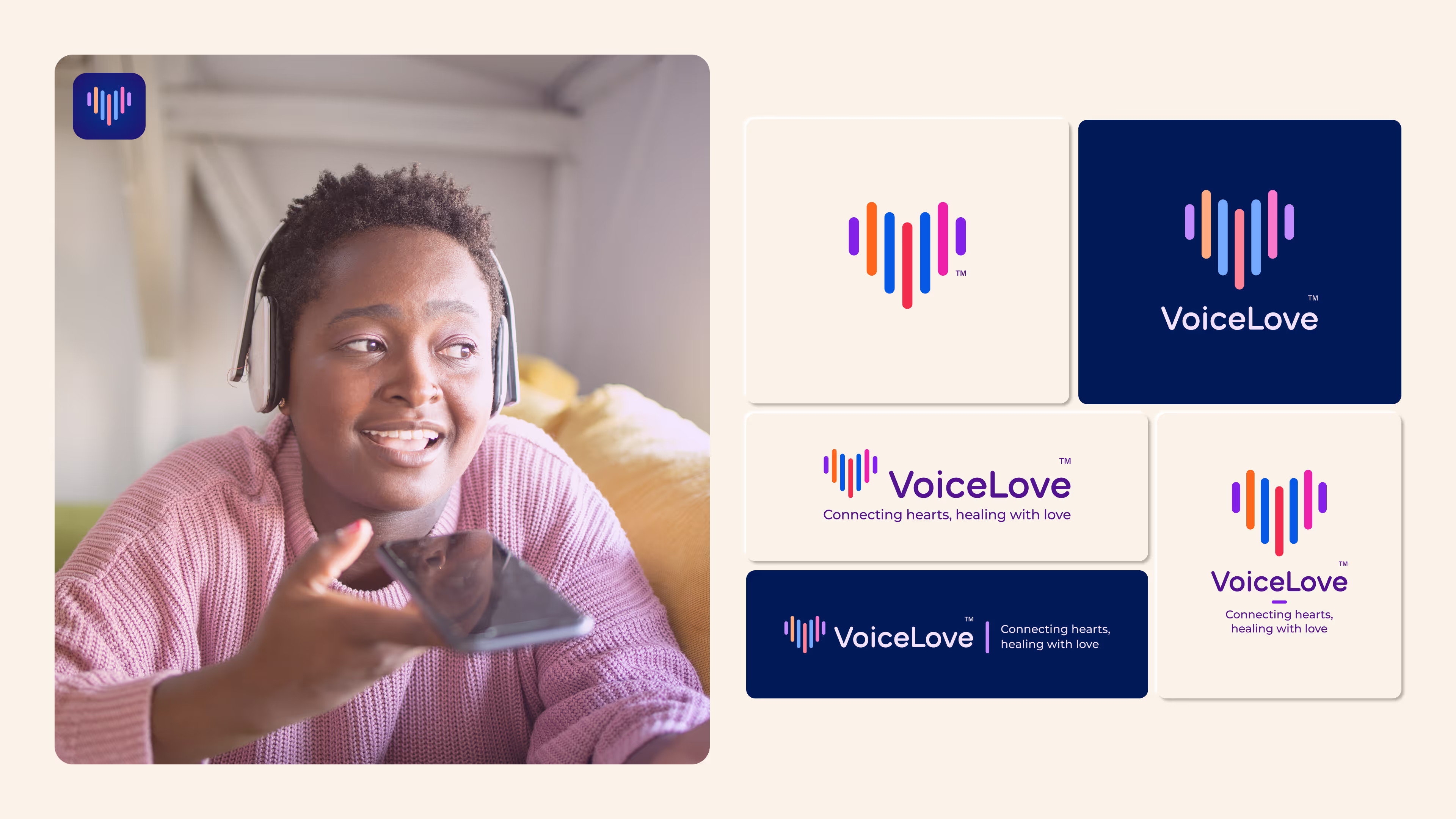
VoiceLove’s technology helps bridge the gap between patients, residents, and their loved ones, restoring a sense of closeness that can be vital to well-being. The team approached Wunderdogs to define the brand’s persona, messaging, visual identity, and website.
Building meaningful connections
VoiceLove wasn’t just created to fill a technological gap; it’s driven by a profound commitment to those experiencing isolation. We began by deeply exploring what voice-to-voice connection could mean for someone in a care setting. By understanding the emotional realities of patients, families, and caregivers, we developed a clear messaging framework that positioned VoiceLove with a compassionate, human-centered voice; one that shaped everything from product descriptions to tone of communication.
Combining technology and personality
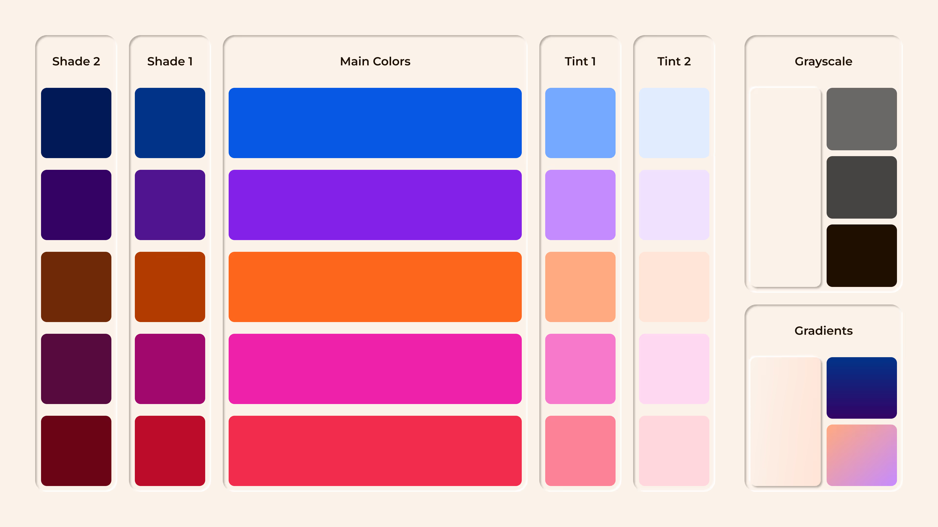
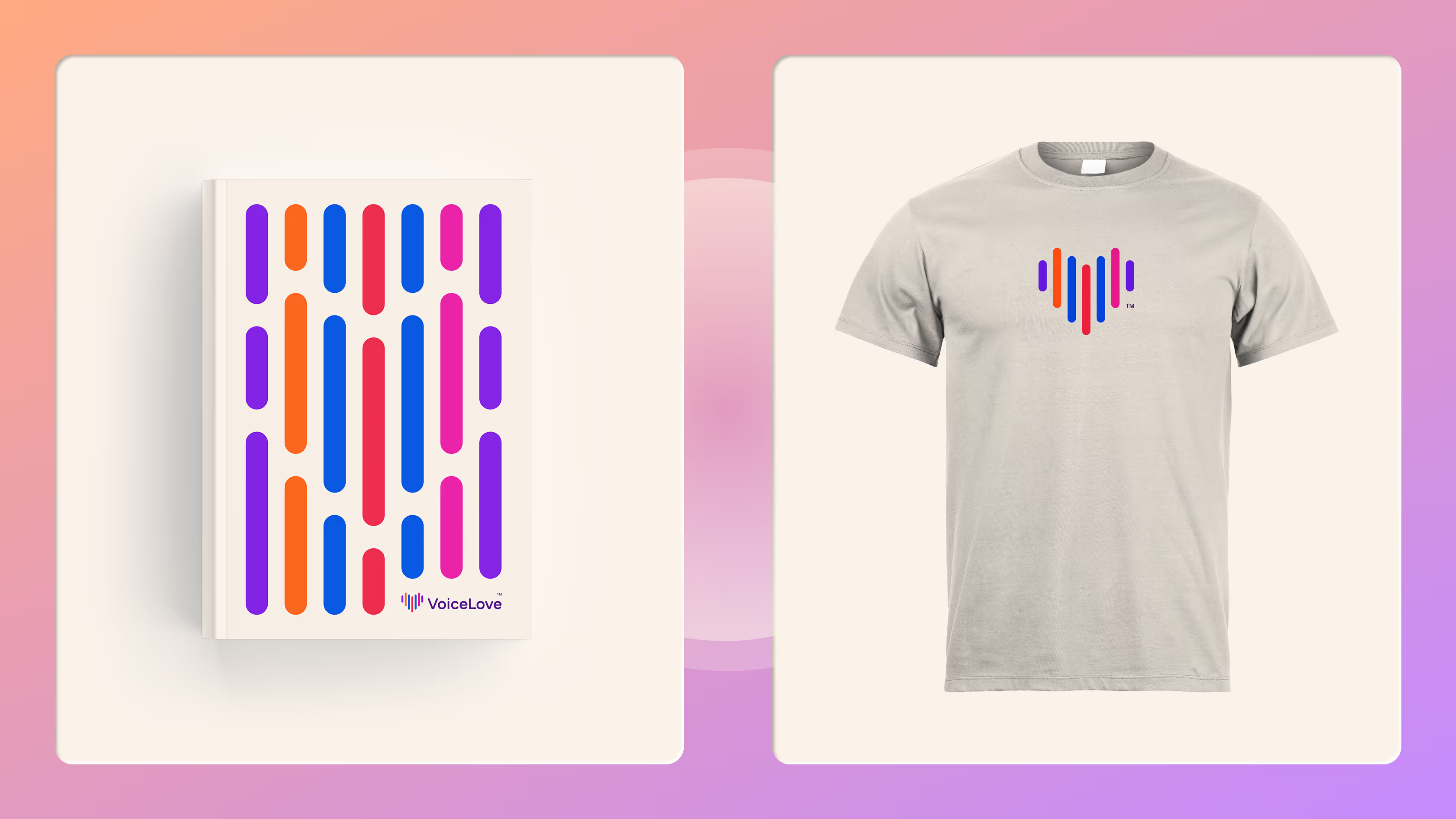
With the brand’s purpose rooted in empathy, we crafted a visual identity that balanced warmth and clarity with technological credibility. A palette of soft neutrals and bright accents allows for moments of calm and focus, while photography grounded in real-life scenarios adds urgency and emotional weight. We wove the logo’s signature sound bars into the broader visual language, turning a product element into a flexible design tool that reinforces the brand’s purpose throughout.
Making a truly accessible experience
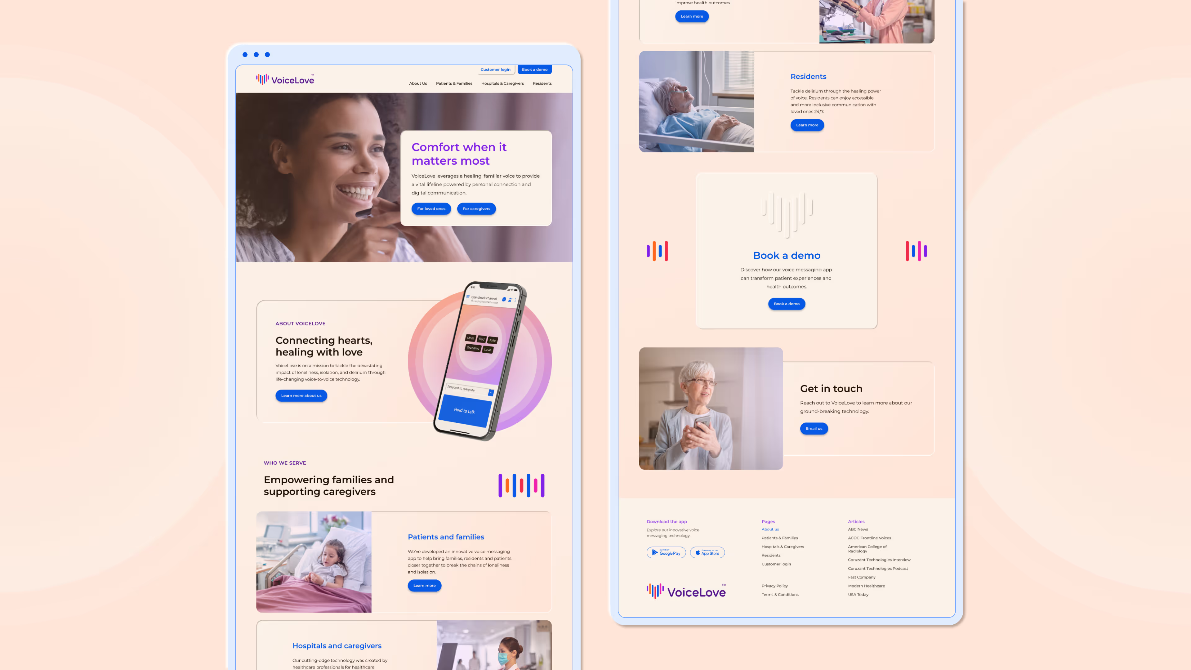
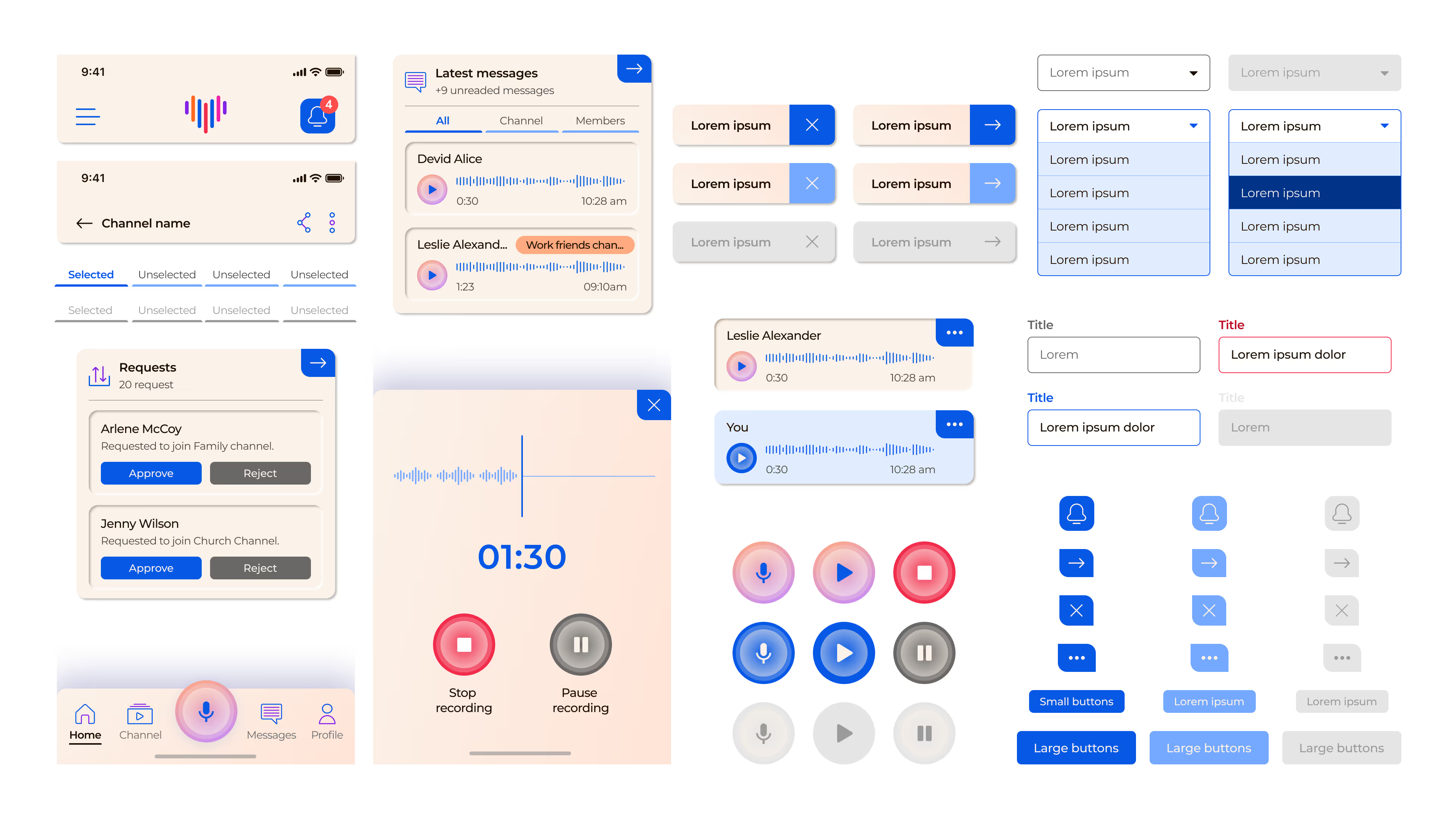
The website needed to serve multiple audiences: patients, families, and caregivers. We built dedicated pathways and messaging for each group, ensuring every visitor could find relevance and clarity. True to VoiceLove’s mission, accessibility was essential: from typography to color contrast to navigation, we followed the latest standards to create a seamless, inclusive experience for all users. The result is a digital platform that extends VoiceLove’s warmth, clarity, and care across every interaction.
Wunderdogs are brilliant! Their creativity and expertise exceeded our expectations, providing exactly what we needed and more. The process was seamless, and we are thrilled with the outcome. They are indeed the top dogs in branding, making the collaboration a joy every step of the way.
CEO, VoiceLove




Building a brand for critical care innovation
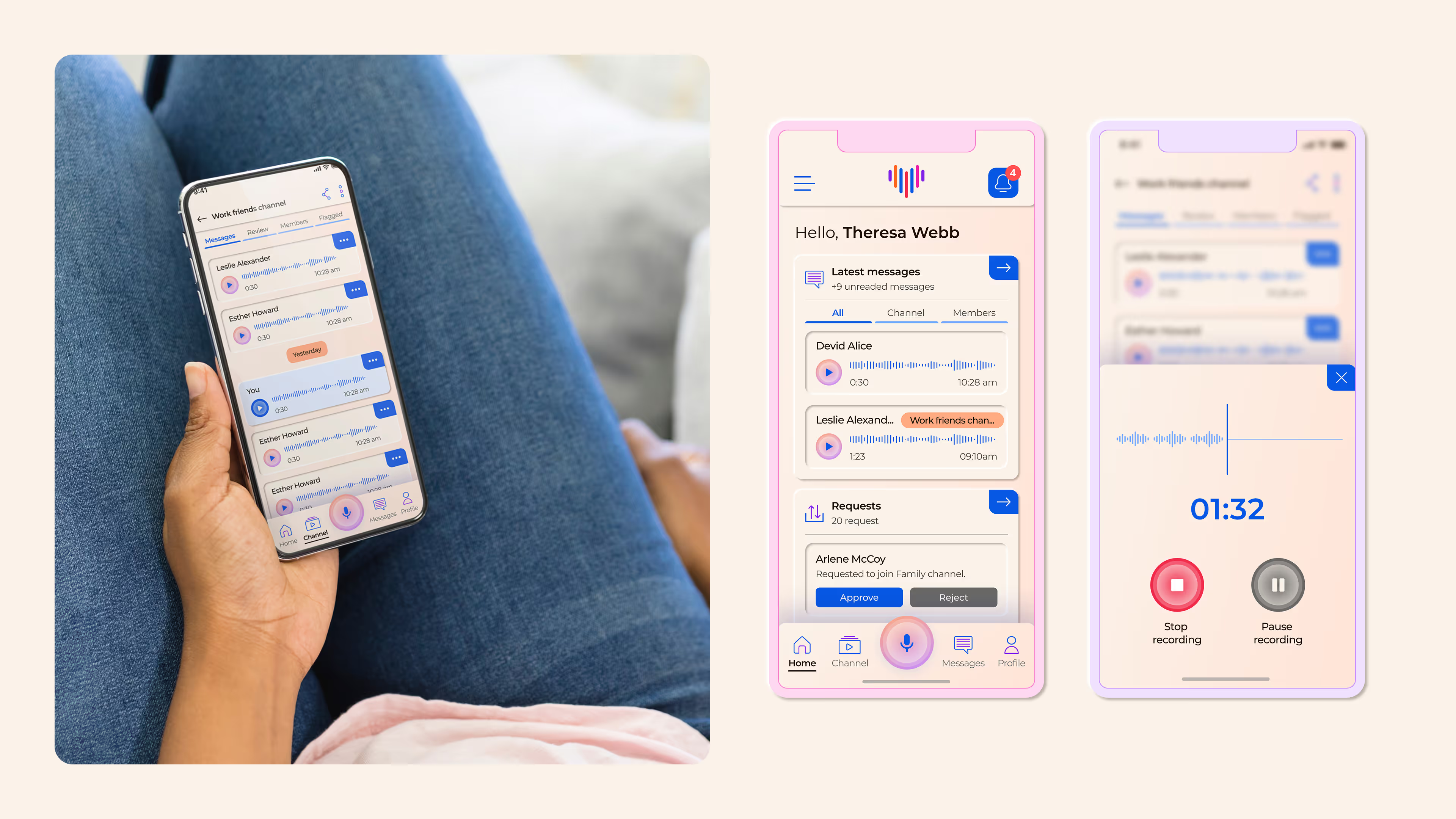
VoiceLove’s brand was built with empathy at its core: designed to speak directly to the emotional realities of patients, families, and caregivers. By understanding each audience’s needs, we shaped a messaging and digital experience that offers clarity, comfort, and connection in some of life’s most vulnerable moments.



.svg)


.svg)