Discovery Ventures

Discovery Ventures is a global venture capital firm with €60M in early- and growth-stage funds, supporting tech entrepreneurs worldwide. We partnered with the team in its early days to create a founder-centric visual identity rooted in their mission and ethos.
Brand and team ethos
The name draws from lean startup methodology, where the discovery phase is critical for understanding the problem. Discovery Ventures puts entrepreneurs, and the problems they solve, at the center of their brand.
From Beta to Better
We developed the concept From Beta to Better, reflecting Discovery’s passion for tackling meaningful, unsolved challenges. It speaks to confident, creative thinkers who move pragmatically toward real solutions. The visual language emphasizes transparency and upward motion; mirroring the iterative journey toward growth and impact.
Visual System
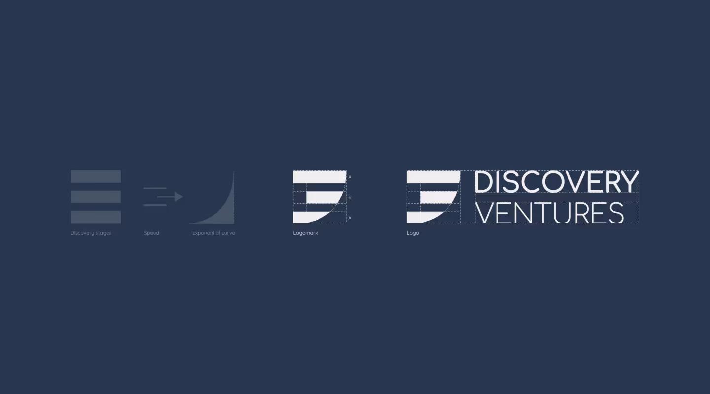
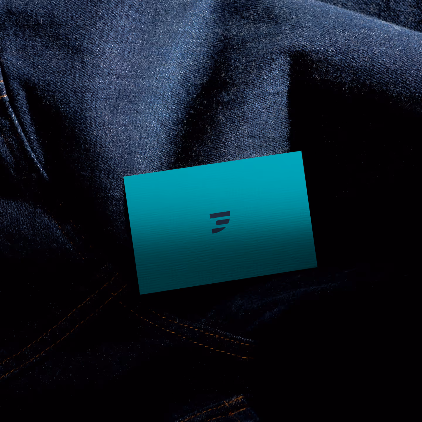
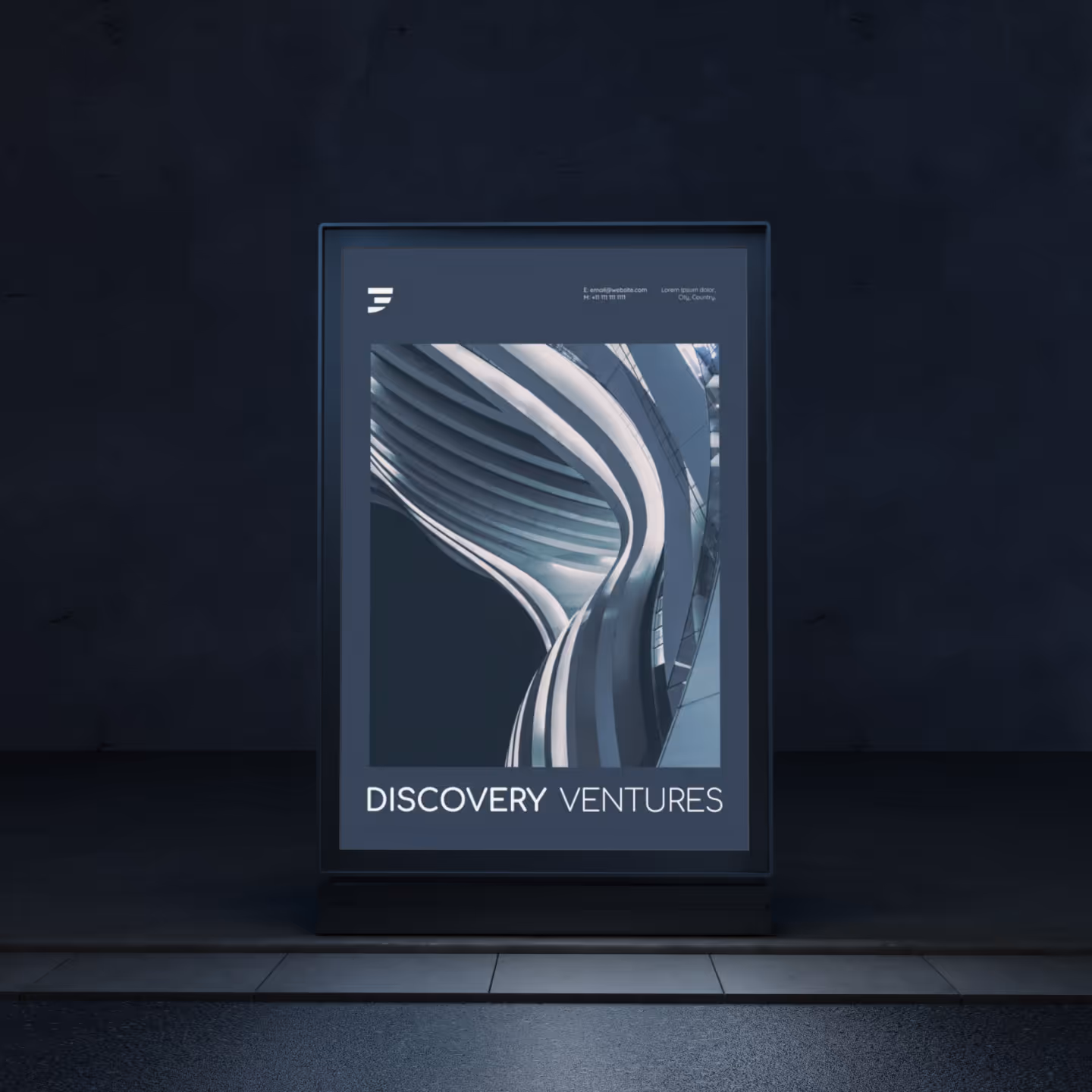
The logo embodies our concept with three overlapping layers forming an exponential curve: a nod to both the startup journey and the growth patterns of Discovery’s portfolio companies. A clean, minimal design system featuring human-focused photography, custom iconography, and bold simplicity, reinforces the fund’s commitment to people and progress.
FROM BETA TO BETTER
The logo consists of layered curves forming an exponential trajectory—a visual nod to the startup growth path. The overlapping forms suggest iteration, resilience, and forward motion, echoing the leaps founders make from idea to impact. Each curve represents a distinct phase in the journey—problem discovery, testing, and refinement—culminating in acceleration. The result is a mark that feels dynamic yet grounded, capturing Discovery Ventures’ belief in progress through experimentation and clarity.

UPWARD MOMENTUM
This design system reflects the thoughtful, iterative nature of early-stage building, as well as the support and elevation Discovery Ventures provides. The exponential curve signals upward momentum, symbolizing the trajectory founders take from idea to impact.


.svg)


.svg)