Revolution
Revolution is a Washington, DC–based investment firm founded by Steve Case, built on the belief that the next generation of transformative companies will emerge beyond traditional coastal tech hubs. With investments spanning venture, growth, real estate, hospitality, and policy-driven initiatives like Rise of the Rest, Revolution has helped back more than 240 companies and shaped entrepreneurial ecosystems across the country.
As the firm’s scope expanded well beyond its venture roots, its digital presence struggled to keep pace. What began as a website redesign quickly became something more fundamental, an opportunity to evolve how Revolution tells its story as a multi-faceted investment platform with deep history, credibility, and national impact.
When a familiar brand starts to feel limiting
Revolution came to us with a clear, tactical need to redesign and rebuild their website. But early conversations revealed deeper tension beneath the surface.
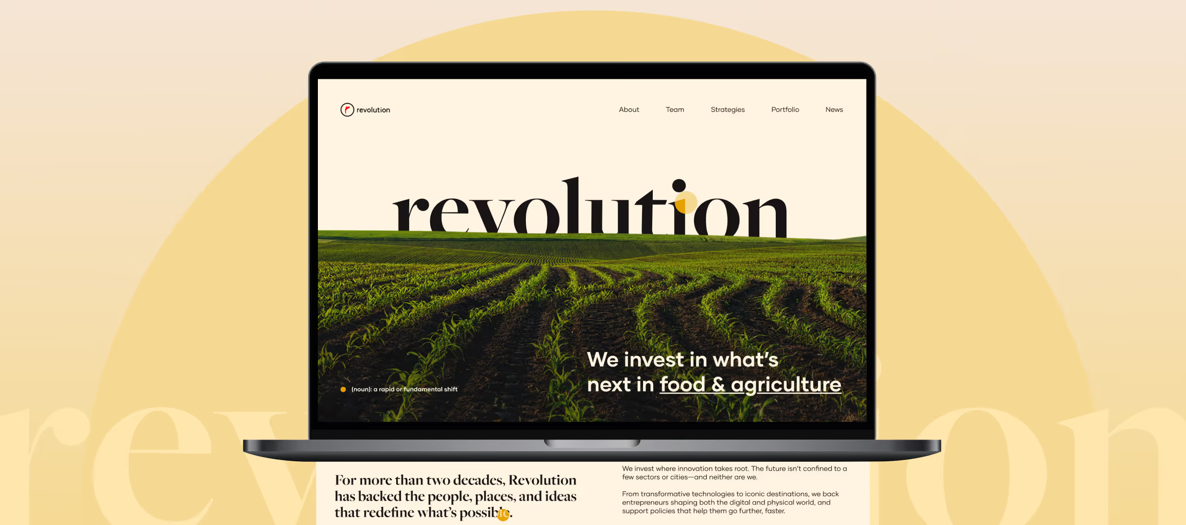
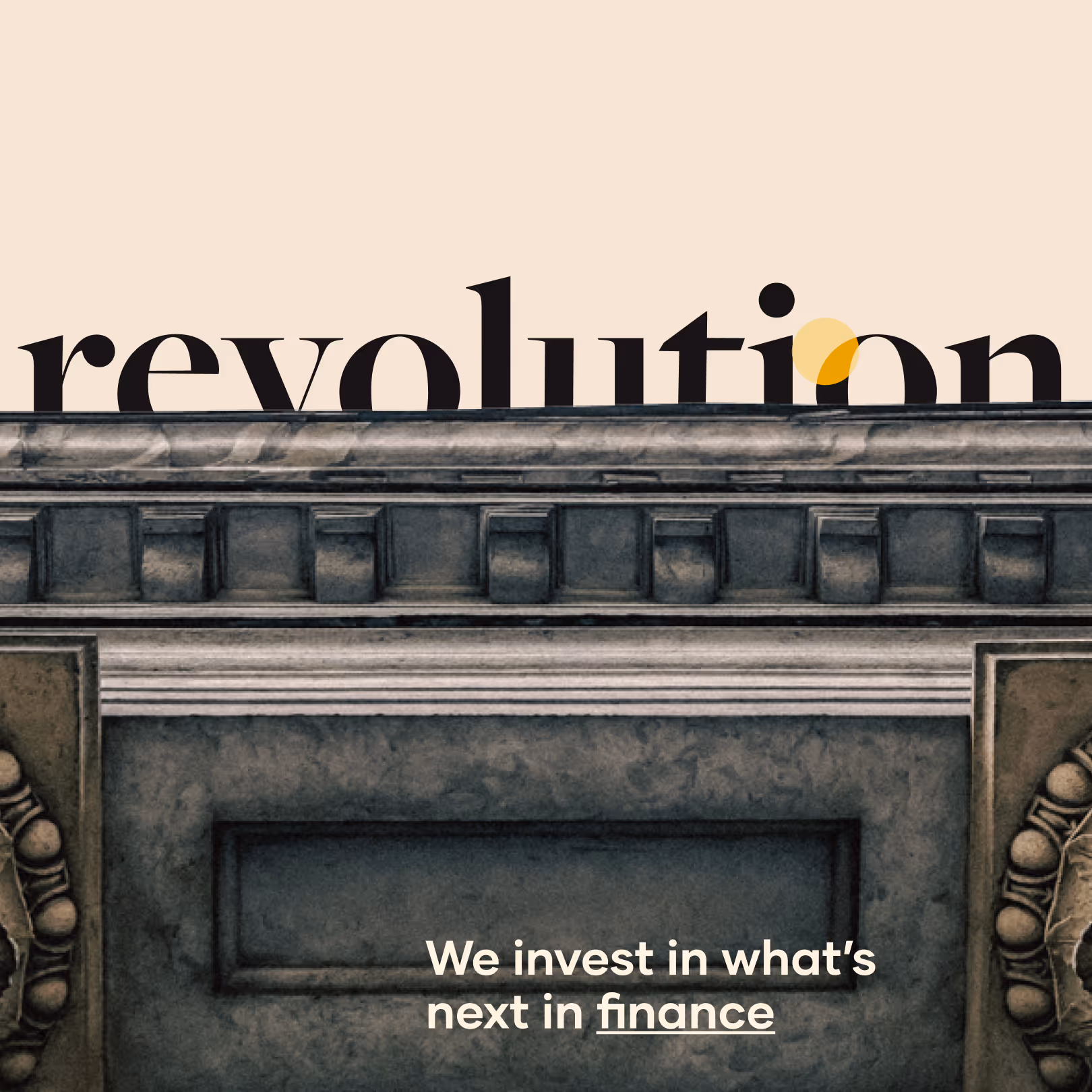
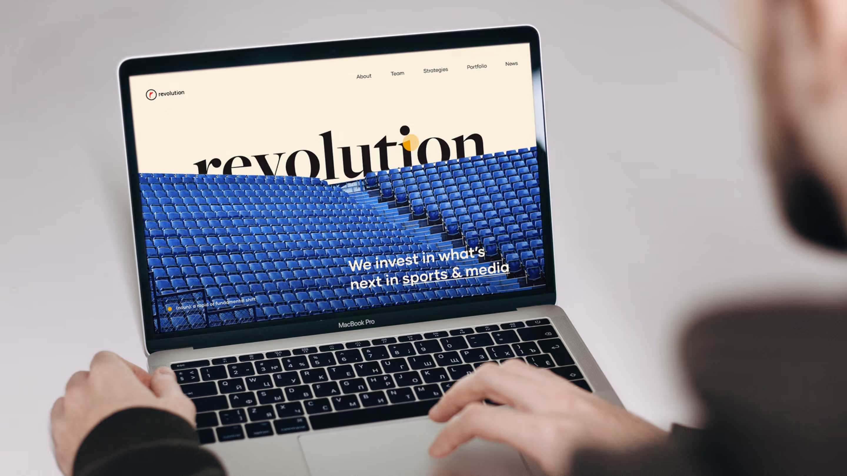
The site leaned heavily on bright red and legacy visual cues that felt increasingly dated and at odds with the firm’s maturity. More importantly, the structure reinforced silos. Ventures, Growth, Real Estate, Hospitality, and Rise of the Rest appeared as separate entities rather than expressions of one cohesive firm. Visitors, particularly co-investors, media, and policymakers struggled to quickly understand Revolution’s full scope and track record
At the same time, Rise of the Rest’s visibility risked skewing perception toward philanthropy, underplaying Revolution’s identity as an investor with a strong thesis and long-term capital commitments. The brand had history, credibility, and success stories, but the site wasn’t telling that story clearly or confidently.
Redesign to recalibration
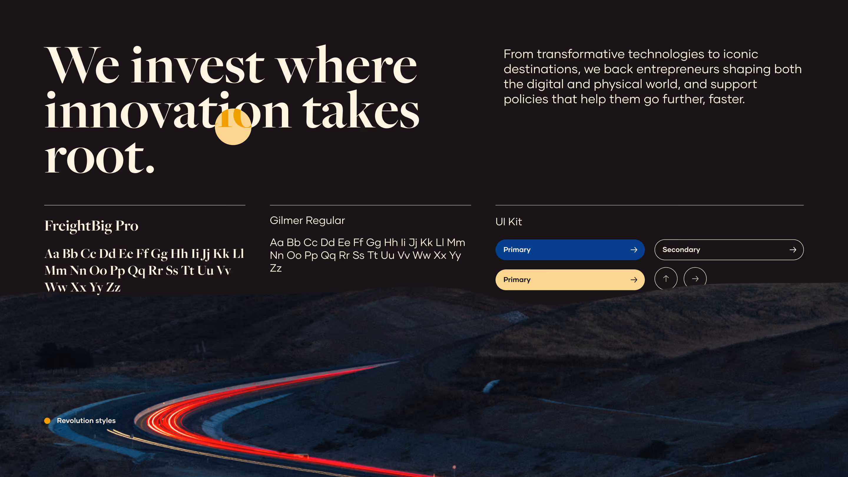
Visually, the work moved away from heavy reliance on bright red toward a more muted, refined palette that signals confidence and maturity. Off-white backgrounds, restrained color usage, and consistent typography elevate the brand without making it feel cold or institutional.
We leaned into simplicity and clarity over visual noise, focusing on structure, hierarchy, and pacing. Animations, interactions and hover states add approachability without distraction, reinforcing the idea that serious investors don’t need to shout to be heard.
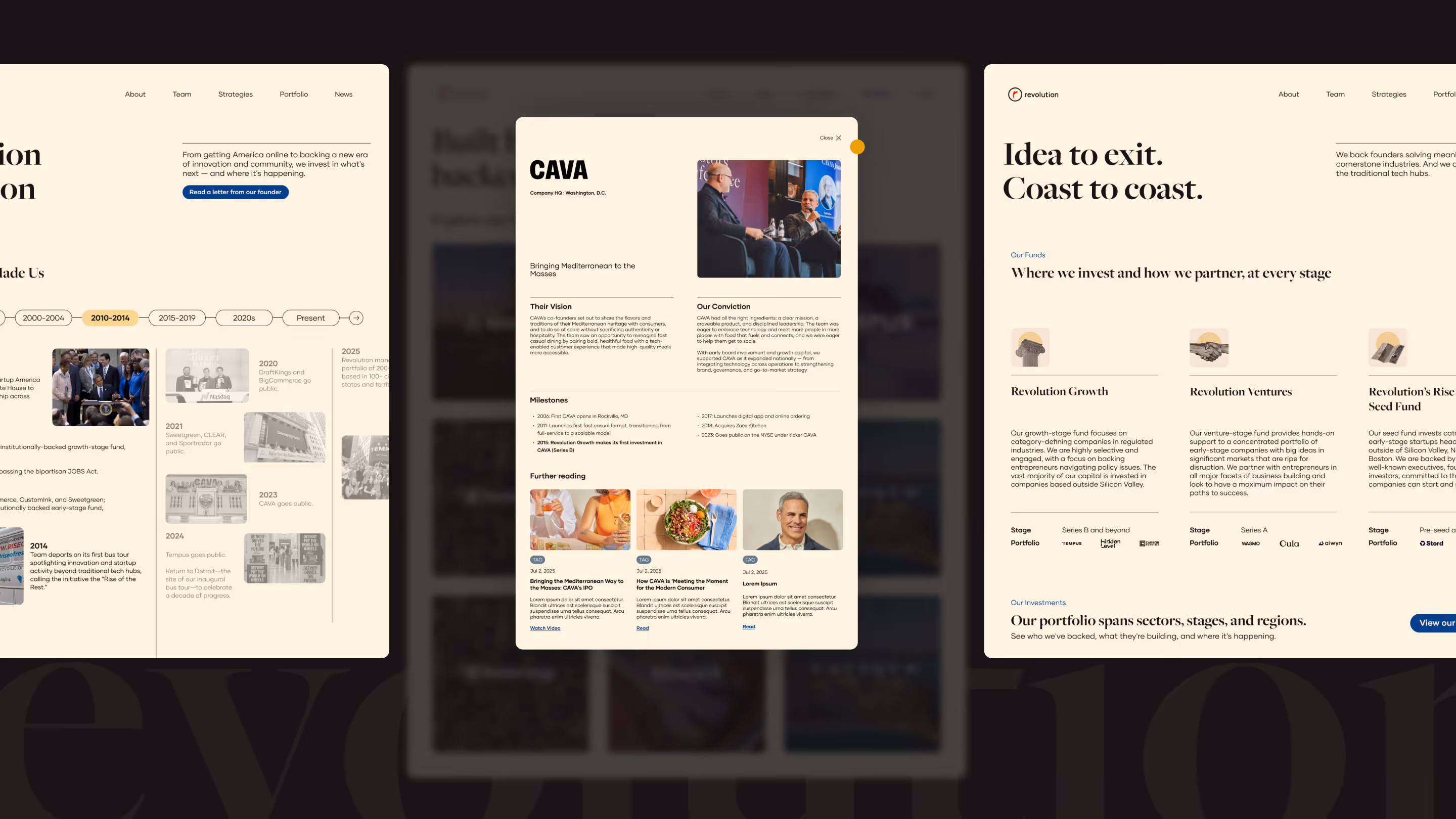
Creating cohesion across the platform
The website architecture was rethought to break down internal silos and present Revolution as one integrated firm. Content paths were designed to serve primary audiences including co-investors, media, policymakers, while still supporting founders exploring Revolution’s perspective and reach.
Built for flexibility and longevity, the site allows Revolution to continue evolving its story as the firm recalibrates its focus toward supporting its existing portfolio, expanding thought leadership, and reinforcing its role as a bridge-builder across regions and industries.
Revolution is a DC-based investment firm founded by Steve Case with a long-standing belief that the next generation of transformative companies will emerge beyond traditional coastal tech hubs.


What began as a website redesign evolved into a broader recalibration of how the firm presents itself toward a cohesive and sophisticated reflection of Revolution as a multi-faceted investment platform. The result is a digital experience that brings clarity to the firm’s breadth, legacy, and point of view positioning Revolution not just as a fund, but as a long-term builder of companies, communities, and capital across the country.


Other works that you might be interested in
.svg)


.svg)